magan ward
Running a profitable digital business doesn’t require subscribing to the hustle-culture in order to make a comfortable living and find true freedom for the things you love most.
welcome to the
blog
for digital entrepreneurs
tune in to the podcast:
5 Ways to Polish your Brand and Site Today
If you’ve heard it once, you’ve heard it several times – brand, branding, brand design, brand colors, brand voice…the list goes on and on. A couple of years back, I re-branded my photography site with the assistance of Caryssa O’Connell of Franklin & Willow. I knew I wanted a fresh brand and site with a […]
Magan Ward
5 Ways to Polish your Brand and Site Today
by
May 7, 2020 8:00 am

If you’ve heard it once, you’ve heard it several times – brand, branding, brand design, brand colors, brand voice…the list goes on and on. A couple of years back, I re-branded my photography site with the assistance of Caryssa O’Connell of Franklin & Willow. I knew I wanted a fresh brand and site with a […]
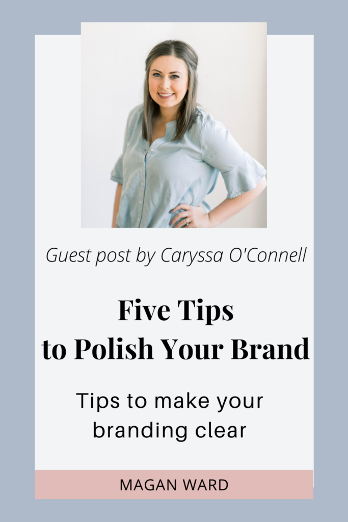
If you’ve heard it once, you’ve heard it several times – brand, branding, brand design, brand colors, brand voice…the list goes on and on. A couple of years back, I re-branded my photography site with the assistance of Caryssa O’Connell of Franklin & Willow. I knew I wanted a fresh brand and site with a new logo and brand colors, so I sought out an expert that could help me focus and find what spoke to me and my brand.
Caryssa fell in love with graphic design in college and quickly realized she loved designing websites and brands! It wasn’t long until she launched Franklin & Willow, helping creatives nail down their brand to stand out from the crowd.
I knew I had to host Caryssa on the blog to talk to you all about ways you can begin to polish your brand and website TODAY – quick tips and hints that will be most helpful to you right now!
Allow me to introduce Caryssa!

We’ve all heard it before…it takes 8 seconds to capture someone’s attention. I would argue even less. But if that’s the case and you KNOW it’s the case, then why are you settling for your subpar logo and brand? Why are you hiding in a corner when you send someone your website link, knowing it’s not as good as it could be?
To play with the big dogs and truly stand out, it’s time to dig in and make your branding and web design memorable, lasting, and match the level of product or service you offer. Make it so good you turn heads (the RIGHT ones) and keep those ideal clients coming back for more and more. It’s time to pull your visual branding together like a pro in a way that’s cohesive, polished, and professional. Want to have a top notch visual brand? I’m breaking down the 5 things you need to do, like yesterday!
1. Get Clear on Your Brand Colors & Fonts
The first thing I recommend doing is creating a private Pinterest board and just go crazy pinning anything and everything that catches your eye. Not sure where to start? I recommend finding pins from the following categories:
- Home Interiors
- Typography
- People (who look like someone you want to work with)
- Textures and Patterns
Once you’re done, head to that board and take a look. Chances are without even realizing it, you’ve developed a board that really looks pretty good altogether. You’ll start seeing a few colors pop out more than others and notice a general vibe going on. This is just what you need to start crafting your visual brand.
Brand Colors
So now it’s time to define your brand colors. I recommend choosing 4 main colors- a dark tone, mid tone, light tone, and pop color. Pick out some colors that you see popping out to you from your Pinterest board, and consider researching some color psychology in order to pick colors that really enhance your brand’s story and personality.
Fonts
Fonts are the next key component. It’s important to stick to 3 fonts, tops, to keep things looking super polished. I recommend having a serif, a sans serif, and a more unique font, such as a script option.
Where to find fonts? Google Fonts is a great resource to find fonts that are free to use. But one of my favorite places is Creative Market. There are thousands of fonts to choose from, and you can actually insert your business name and see how it looks in that particular font. Now most of these you have to pay for, but the bonus of that? You have a font that most people aren’t using! And usually it’s a bit more unique and can really make your brand stand out.
Font Structure
Now once you’ve picked out your fonts, you’ll need to develop a font structure. Pick which font you’re going to use for titles, headings, subheadings and paragraph text. Then play around with the sizing and spacing until you like the way each one is styled. This structure should lead the reader effortlessly- first through the title, then the heading, the subheading, and finally the paragraph text (AND look good all at the same time!). Then use that font structure throughout all of your materials to maintain consistency in your text’s appearance.
2. Design Branded Templates for Frequently Shared Graphics
Instagram stories and Pinterest pins are great ways to extend your visual brand past just your logo and website. You can do this by using branded templates for your social media posts.
Instagram Story Templates
First, decide what Instagram story highlight topics you will have. Then for each one, what type of stories will you be posting most often? Is it recipes? Testimonials? Links to the latest blog post? There are a million possibilities. But once you’ve got this figured out, make a story template for that topic. I do this in Illustrator, but you can do it in programs like Canva as well.
I recommend 2-3 versions of that template per topic – maybe consider different color combinations to keep it fresh each time you share to your story. That way, when you have a new blog post to tell your social media audience about, you’re not just screenshot-ing that post and adding some text to it. Instead, you’re inserting the photo and title into your beautifully branded template and sharing THAT instead. There are a ton of free pre-made templates out there too and also some you can purchase. Just a reminder to make sure the templates you choose follow the visual branding you’ve already established.
Pinterest Templates
You can do the same for Pinterest. I recommend creating 3-5 different styled templates. This way, when it comes time to share, you can again just pop your photos and text into the templates quickly and easily. AND in a way that beautifully accompanies your brand!
3. Schedule an On-Brand, Professional Photoshoot

Professional photos can be a game changer on your website. Often when you find a website you absolutely LOVE, ya know what you’re actually falling in love with? The photography. All of the photos – the headshots, styled images, everything – are polished and simply look good with the colors and styling of the website. Let me give it to you straight: You can have the most beautiful website in the world, but if your images are dark, cloudy, pixilated, and have weird filters applied, it can be a total buzz kill and your visitors will have a hard time taking you seriously. It’s the hard truth…photos can make or break your website.
Match your Outfit to your Branding
When planning your brand photoshoot, think about what outfits you have that represent that same feeling and vibe you get when you look back to your Pinterest board. What colors are going to work nicely with the brand colors you’ve picked out? If in doubt, stick to neutrals.
Choose a photographer who will allow multiple – or better yet? Unlimited outfit changes. Also think about bringing a few jackets, cardigans, or different accessories to capture many different looks without wasting too much time changing. This will give you plenty of options to use across your social media and website, without showing up wearing the same outfit every time.
Stock Photography
Now I get it, we don’t want every single photo to be of our face. And quite frankly, sometimes we just run out of photos from our own shoot and want to juice it up with something else. Styled stock photography is a great resource to tap into! Sites like Social Squares, SC Stockshop, Haute Stock, and Unsplash among many others are great places to find beautiful stock photography for creative business owners.
4. Create Consistency in your Web Design and Site Flow
See a common theme here? Consistency girlfriend! A couple ways to do that on your website?
- Refer back to that font structure you made earlier,
- Limit your use of color,
- Use specialty fonts and fun details sparingly,
- And allow for plenty of ‘white’ space.
Doing all of this will keep your website from looking cluttered and disorganized.
Site Flow:
Think about your end game, from the very beginning. What’s the route you want your website visitor to take when clicking through your website? Where do you ultimately want them to end up? Be strategic in the way you lead them through your online home. You can do this with the order of information on each page, through the use of color, and by using strategic call to actions. You should NEVER have a page that leads to a dead end. And in this case, while important, your footer navigation doesn’t count. Your viewer won’t know where to go next unless you tell them exactly where they should go!
Color Psychology:
Another trick? Choose a color (maybe that pop color from before?) to be used almost solely for your links. Anytime there’s something you want your visitor to click on, make sure it’s in that color. When you use the same color for all the links, you train the reader to click everything they see in that color. Once they get to the part of your website where they have the opportunity to book or purchase, it makes that click THAT much easier!
5. COMMIT.
I’m going to keep this one short and sweet. Once you have your branding established, you HAVE to commit to it. No looking back here, sister. Go hard and make your branding so clear someone can see any piece of your marketing puzzle and immediately associate it with you. So where else do you need to implement your branding to reinforce that visual brand identity? Here’s a list to get you started!
- Website
- Social media
- Blog
- Client documents (contracts, invoices, pricing pdfs, etc.)
- Email newsletters
- Business cards
- Note cards
- Packaging
- Marketing Materials
- Courses
- Opt in Freebies
- Digital Downloads
- Online Ads
- Storefront Window Displays
When you have a clear, polished, professional brand and online presence, you will break through the noise of your industry and start seeing serious results.

Thank you so much to Caryssa for offering us this amazing advice on branding. I hope that it is most helpful to you! If you would like to enlist her help on any of this, I’m sure she would LOVE to hear from you! Even more, she just launched her brand new site and branding today so you can check out her most recent work by visiting her site – which JUST launched with her own rebranding this morning!
Where to find Caryssa:
i: www.instagram.com/franklinandwillow
f: www.facebook.com/franklinandwillow
p: www.pinterest.com/franklinandwillow
e: hello@franklinandwillow.com
For more tips on life and business make sure you bookmark Magan Ward and head on over to the blog!
Do you love this post? Pin it to Pinterest using this image below to make sure you have it in a safe place to revisit!
